WORK
FEDERAL TRADE COMMISSION
#D9D9D9
#868080
#474B4D
#97BCC7
#006884
#053D57
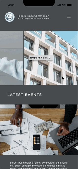
The Federal Trade Commission (FTC)'s current website can be overwhelming for users as it displays immense information in a monotonous format. This can make it difficult for users to easily access, find, or complete their objective.
My mobile and desktop redesign allows users to navigate through immense information more quickly and efficiently.

Lato (regular)
Lato (bold)
Inter (regular)
Montserrat (regular)
PROBLEM
The current Federal Trade Commission website has an overwhelming amount of information making it difficult for the user to navigate and utilize.
SOLUTION
The website redesign creates a more efficient and simplified navigation to allow users to find the information easier without feeling overwhelmed or confused.
METHODS:
INTERVIEW
Four interviews responses
Examples questions:
- What are your biggest concerns regarding covid at this time?
- What do you do in your day to day life to protect yourself from covid?
- How do you prepare and plan for an upcoming trip?
AFFINITY DIAGRAM
Our team compiled our survey and interview answers into a common categories which allowed us to examine their primary concerns and brainstorm the app's key features.
USER TESTING
User tests were performed to understand what pain points they experienced while using the current FTC website in order to see which areas needed to be improved. Testing indicated that it was difficult for the user to complete tasks that were assigned, such as finding certain common topics or features.
SITE MAP